How many times have you abandoned a signup process because it took too long, required too much information, didn’t work or was counterintuitive? We wanted to analyze how other web-based applications were faring in their signup and trial processes, then highlight the good, the bad, the ugly.
The best way to tackle this was to sign up for 10 popular web-based applications so we could experience the processes first hand and audit how responsive or engaging they were. Would companies know that we were inactive and what would they do to try to re-engage us?
We completed all the steps needed for a trial or account activation and let the accounts run inactive.
Here are the 10 companies we audited:
- Asana
- Atlassian
- Constant Contact
- DocuSign
- EchoSign
- Jive
- MailChimp
- New Relic
- Twilio
- Yammer
In addition to assessing their contact with us, we also evaluated their signup process in terms of number of steps, fields and decisions that needed to be made to reach activation.
Signup & Trial Process Benchmarking Report
Conducted by Daphna Levin
Introduction
If you offer a web-based application with a freemium or free trial model, it’s a good idea to periodically audit your signup and trial processes. Doing so will help you keep an eye on how users are experiencing the two most critical stages of your customer lifetime funnel.
To find out for ourselves how users experience signups and trials, we rolled up our sleeves and signed up to 10 popular web-based applications. We completed all steps required for trial or account activation, but were otherwise inactive. Among other things, we were curious to find out, whether the companies would realize that we were inactive during the trial and what actions they would take to try and engage us.
While the focus of the research was on the communications with us as a trial user during the trial, we also evaluated the signup process in general in terms of the number of steps, fields and decisions that needed to be made to reach activation.
Conclusions
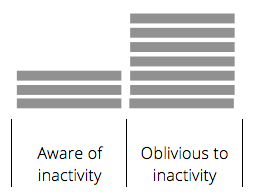
- 70% were completely oblivious to the fact that we hadn’t even logged in once after initially signing up!
- Surprisingly many (60%) companies didn’t address us by our first name, or our name at all for that matter.
- A majority (60%) of companies used generic e-mails that were totally out of context, or dumped too much information on us in one sitting.
The best companies:
- Were completely aware of our inactivity and offered various ways for us to reach out for support. The most helpful emails were those that included the emails and phone numbers of a coach or customer success rep.
- Sent us relevant and helpful emails that related to how we were engaging (or in this case not engaging) with the app.
- Treated us like humans and attempted to establish a real relationship with us.
The Research
10 companies were selected: Asana, Atlassian, Constant Contact, DocuSign, EchoSign, Jive, MailChimp, New Relic, Twilio and Yammer
Signup was measured in terms of:
– Steps to completion: the number of steps in the funnel
– Information cost: number of fields to complete
– Effort investment: number of decisions to make and actions to take
– Signup friction: big picture summary of steps, information and effort required to sign up
– User orientation: identifiers that set expectations and communicate where we are and what comes next
The trial was measured in terms of:
– Personal care: whether emails were addressed personally
– Helpfulness: how helpful were attempts to engage us
– App awareness: how aware or oblivious the apps were to our trial absence
The Results – Sign Up
Steps to completion
“Steps to completion” is defined as the number of steps in the funnel, or the series of pages that a user must complete to finish signup and gain access to the application. Some companies request different types of information (user profile, account profile, credit card information) in one step, while others break this down into a few steps. Most companies have 3-5 steps in the registration though one has as many as 7.
In terms of steps to completion, Constant Contact had the least with just 1 step; however the 1 step was composed of a few sections, so it wasn’t necessarily the shortest signup. But as soon as we were done, we were in the app:
Information Cost
“Information Cost” is defined as the number of fields (optional or otherwise) that a user must complete. We found that 80% of our companies required 5-16 fields; however 20% requested more than 20 fields. Some of the easiest forms to complete belonged to Twilio, Asana and Jive.
Twilio:
Asana:
Jive:
Effort Investment
“Effort investment” is defined by how many decisions users must make (ie: how many plans to choose from) plus how many additional activities are required to sign up (ie: confirm email, confirm humanity). The effort investment required by our 10 companies varied from very low to painfully high, where one company offered a staggering 27 options to choose from, and 3 different activity types.
Asana was the clear leader here, with just having the user confirm their email – a standard activity across all companies. Twilio was also a leader here, requiring only that the user verify humanity – and even when this wasn’t entirely verified you could still access the app.
Signup Friction
“Signup friction” takes everything into consideration so that we can see the big picture; it’s the sum of steps to completion, information cost and effort investment. Some companies require few steps to sign up but they’re long and require a lot of effort, while others require many short and quick steps. Signup friction calculates how hard a user has to think/work to sign up.
The easiest most friction-less signup was offered by Twilio. What we really liked about the Twilio signup, is that in one critical step that we were unable to complete, (confirm humanity through telephone), we were still given the option to skip the step, access the app and “verify later”.
User Orientation
The signup process is usually composed of a number of steps. Titles, buttons, and general layouts serve to orient the user with the process and build user confidence as the signup progresses.
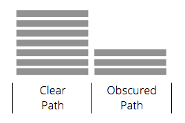
Clear path
Elements that cleared the signup path:
– Clear distinctions (buttons and titles) between different stages in the signup process, confirming when one process was completed (Create Account) and when a new process had begun (Create Profile).
Yammer did a really good job at orienting us with the signup flow:
Obscured path
Elements that obscured the signup path:
– Repetitive “Getting Started” references at various steps in the funnel.
– Blurred stages in the funnel with buttons indicating that each step would be our last.
Results – The Trial
Personal Care
Most companies addressed us by our first name, but a good portion did not:
Helpfulness
“Helpfulness” is defined by helpful emails that show a genuine interest with how we are using their app. Helpful emails are anchored to our needs; unhelpful emails are anchored to the company’s needs or agenda.
Our favorite helpful email was sent from Jive:
This email is really great because:
- Subject sounds sincere and sets the tone.
- It’s from a real person, with a real email.
- It’s from a Success Coach, which sounds official and makes us feel important.
- Provides instructions for getting started.
- Provides numerous ways to make contact (phone and email), and also offers support phone numbers whether we’re in the US or not.
- The last “recommendation” is also a nice touch, since again: it sounds like a tip from someone who is trying to help us get start on the right foot.
App Awareness
Of the 10 companies that we signed up for, an astounding 70% were completely oblivious to the fact that we hadn’t even logged in once after initially signing up! Some companies sent generic emails that were introductory to the app (how-to’s), while others sent irrelevant emails that had no business being in our inbox (conference promotions).
The most aware companies were: New Relic, Jive and Constant Contact
New Relic was especially attentive to our lack of usage, sending us personal emails from a customer success agent who offered to schedule a call and provided personal contact information. We also received 2 emails from the marketing VP encouraging us to engage with the app.
After a period of inactivity, Constant Contact sent us an email that attempted to remedy the reasons for our inactivity. The subject, title and buttons all speak to a potential reason why we hadn’t yet engaged with the app, and provided a potential trigger to get started.
Click below to get the PDF of the report plus 9 tips to a happier and productive signup and trial!


Andy says:
Great info Ellis! I’ve been using this info to to make our signup process for our new freelance project management tool nifthq.com as painless as possible. It seems like the perfect combo is the least friction possible, and enough interaction with the user depending on their actions during the trial period. Thanks!
Sahil Parikh says:
Great article and timely! We will be using the analysis in our new app brightpod.com
Sahil Parikh says:
Great article and timely! We will be using the analysis in our new app brightpod.com
Vik Chaudhary, CEO OnBoardify says:
Dominique, an awesome review of trials. Do the products you reviewed have a Free/Trial/Paid versions, or just Trial/Paid, or just Free/Paid versions – interested to know which products are in each of these 3 categories. Keep up the great work!
Vik Chaudhary says:
Dominique, an awesome review of trials. Do the products you reviewed have a Free/Trial/Paid versions, or just Trial/Paid, or just Free/Paid versions – interested to know which products are in each of these 3 categories. Keep up the great work!
Shai Alon says:
Great article. I believe that one well targeted and relevant email is superior to 10 automated irrelevant ones.
Shai Alon says:
Great article. I believe that one well targeted and relevant email is superior to 10 automated irrelevant ones.
Shipwire says:
Awesome piece. Shipwire appreciates this blog post as we look at our global warehouse free trial.
Shipwire says:
Awesome piece. Shipwire appreciates this blog post as we look at our global warehouse free trial.
Treff LaPlante says:
Thank you for this excellent and well done piece…very informative.
Treff LaPlante says:
Thank you for this excellent and well done piece…very informative.